

Find your perfect
color scheme

The color scheme of your event plays a significant role in setting the mood for your wedding. Colors can create an atmosphere and bring personality to your decor. Understanding color psychology is a great starting point to pinpointing the mood you want to create.
Color Psychology


-
Warm colors like reds, oranges, yellows and rusts are associated with energy, excitement and warmth. They can create a lively and inviting atmosphere, and often stimulate conversation and engagement.
-
Cool colors tend to evoke feelings of calmness, serenity and tranquility. These colors can create a peaceful ambiance.
-
Neutral colors like white, beiges and greys provide a versatile backdrop that can convey elegance and simplicity. Neutral palettes are often used for formal events because they feel timeless and classic. With dark settings or against dark backdrops, white floral arrangements can make a huge visual impact through artful contrast.
-
Using vibrant colors can generate excitement and energy, making an event feel dynamic, fun and playful. Bohemian and rustic weddings can play really well with bold and bright color schemes.
-
Soft pastel shades evoke feelings of sweetness and romance. Blending light shades and tones can create a gentle and inviting vibe that feels intimate and personal.
-
The way colors are combined can influence mood. High contrast arrangements create drama and excitement. Monochrome arrangements can feel classy and timeless.


How many colors should I choose?
Try keeping your color scheme to 3-5 colors, unless you plan to go strictly monochromatic. Introducing too many colors can make your entire scheme look disjointed and unrefined. Too few and things can get boring!
Remember to choose colors that you gravitate towards, not because they are trendy. Trends come and go, but your wedding pictures are going to last forever!
Take cues from your venue
What’s your venue like? is it a blank slate like a tent, or are you having your ceremony in an old-world castle with dark woodwork and paintings on the walls? Are there colors in the reception or ceremony areas that might clash with your proposed color scheme, or can they work in harmony?
Looking around the spot where you’ll be celebrating is a great way to pick up hints for a harmonious color scheme. Snap a photo of the place you plan to get married, or the reception area. Is there a lot of greenery that maybe you want to tie in with your color scheme? Wood tones that would pop with some contrasting vibrancy? Are you hoping to get married under blue skies, or at golden hour?
One useful tool is Adobe Capture - a free app that lets you take a photo and create a color scheme from the colors in the photo. Simply tap the “color scheme” icon in Adobe capture, take a picture of your venue, and a five color palette will be generated for you, which you can then tweak to your heart’s delight.


-
Summer is an explosion of colors and blooms. This is your time to play with bold, bright color schemes if that’s your thing! Warm peaches, pinks, pops of green or blue - summer is about joy!
-
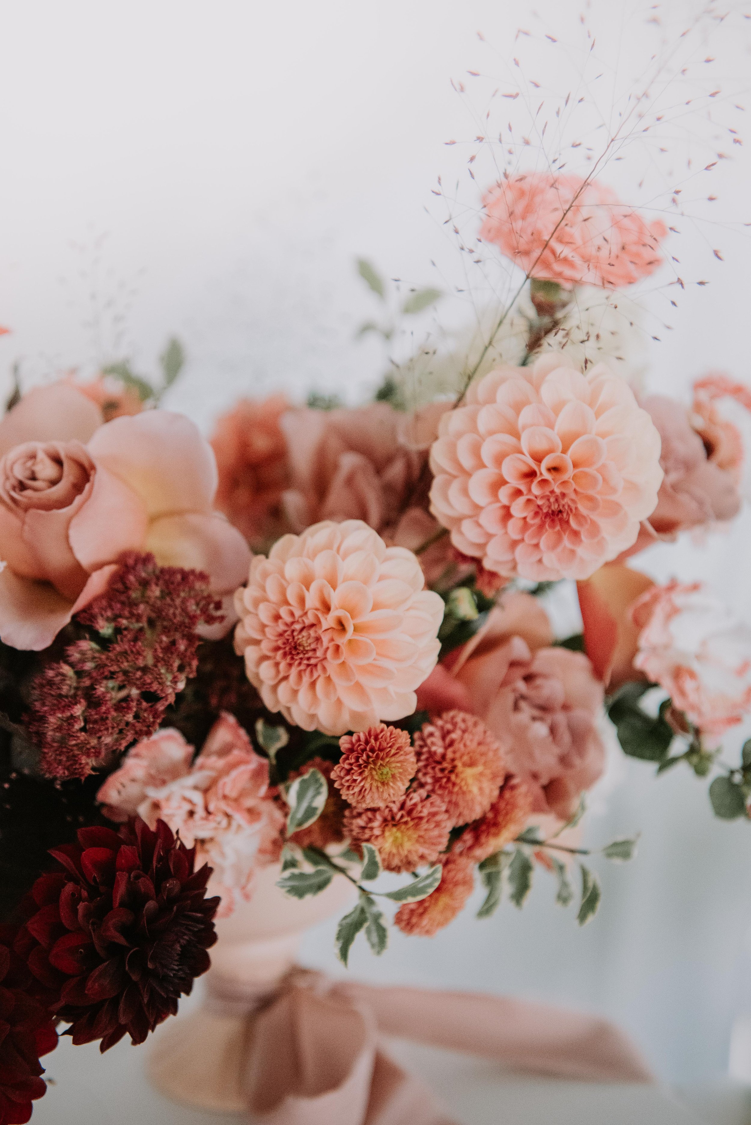
Fall is a great season to embrace warmer, jewel-toned color schemes, or more muted palettes with earth tones mixed in. Think copper, orange, gold, beiges, and burgundies.
-
Not into Christmas themed weddings? Go with icy tones - silvers, blues and whites are especially striking.
-
Pastels are always welcome in spring! soft pinks, peaches, greens and cream are always in style.
Embrace the season
What’s your wedding aesthetic?
Do you gravitate more towards classic or modern? Bohemian or minimalist?
Check out our wedding archetype guide to figure out the theme that speaks to you and the color schemes that work well within that aesthetic.

Ask for a second pair of eyes.
Sometimes we get blind to our own environment and don’t realize how much we are creatures of habit. Ask your best friend to point out what colors you decorate with the most, and what colors you tend to wear. Their answers will probably make you go “wait, I have a personal color palette?”

Add contrast
do you feel like your color scheme is almost there but is just missing that little something?
Just like salt brings out flavors in any dish, contrast brings color schemes to life. Add a color into your scheme that is directly opposite on the color wheel, and/or significantly darker or lighter than the other colors in your scheme.
If you’re going for all white: add a pop of deep green to ground everything.
If you’re using warm golds and peaches: add blue or teal.
If you’re embracing pink and/or red: add green.
Feeling blue? Add a sprinkle of peach/orange into the mix.
All neutral? Add interest with something dark, like a forest green or burgundy.


Ask your florist
Ask your florist to suggest flowers that will be in season during your wedding date. Having an idea of what’s available will help you narrow down choices. Summer is full of an abundance of choices, but winter is much more limited as far as what’s in season, so having an expert on your side to help you consider options you may never have thought of is a huge plus!